Photographers will frequently tell you—without being asked—that they focus more on a picture’s edges than the subject. Until you stand in a gallery and observe how the eye wanders, it sounds backwards. A stray branch here, a bright corner there, and all of a sudden, the portrait you were supposed to be looking at has lost the battle. Silently, the border has spoken for itself.
When older photographers talk about this, a specific memory comes to mind. In a darkroom, the Omega enlarger hums. The chilly head is clicking. The lengthy, almost contemplative process of deciding how much white to leave around the image began after a negative was slid into position. A quarter of an inch seemed traditional. An inch and a half felt purposeful, almost haughty. There was not a single border that was restless. Every decision had significance, even if no one could express it.
We might be underestimating the extent to which these choices influence the cultural transmission of photographs. A thick white mat with a wedding portrait on it reads “heirloom.” When the same image is cropped flush to the edge and shared on Instagram, it appears as content. same image. distinct power. It has been interesting to watch this develop over the past ten years because many photographers don’t seem to notice that the border has changed from a craft decision to a marketing one.
Californian landscape photographer Ralph Nordstrom once wrote about a redwood photo that he almost ruined by failing to notice the upper-left corner. A thumbnail-sized patch of bright cloud had infiltrated the picture. Even though the path leading in was textbook and the God rays in the trees were breathtaking, the eye kept returning to that tiny flare of light. Later, he cropped it. The image was effective. But the lesson stuck with him more than the picture. According to him, attention is drawn to bright, sparkly objects. That’s just the way the brain functions.
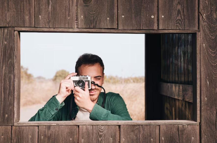
Photographers who give borders a lot of thought seem to be thinking about control. control of the experience rather than manipulation of the audience. A window on an airplane, an arch, a doorway, a tent flap, and a frame inside a frame are examples of boundaries inside boundaries. They direct the eye’s resting place. They imply a hierarchy. Persuasion differs from a press release in that the audience feels guided instead of instructed.
However, all of this has become more complex in the digital age. A few years ago, white borders on Instagram gained popularity, then subtly declined before making a comeback. Raising contrast and allowing the image to breathe are claims made by some photographers. Some consider them to be priceless, almost theatrical. Determining which side is correct is difficult. Most likely neither, completely. In actuality, a border is a tiny, precise choice that serves a particular purpose, and when it succeeds, you are completely unaware of it.
That could ultimately be the edge’s quiet power. It keeps the picture in position. As Nordstrom liked to say, it keeps the eye trapped inside the frame. And the photographers who are aware of this are the ones whose images continue to be popular long after fashions change.